

Hello

Showing posts with label Branding and Strategy. Show all posts
Showing posts with label Branding and Strategy. Show all posts
Going social
After years of living as virtual recluses, we've finally gone social — you can now follow us on Facebook and Instagram. And for the month of July, new followers will be entered into a draw to win a limited risograph print designed by us. So what are you waiting for? Follow and spread the word, and we'll love you forever, virtually anyway.

UTS Health — Growing excellence
The University of Technology, Sydney is traditionally seen as more of a ‘vocational’ institution. But for the Faculty of Health, this doesn’t reflect their overall contribution to the field of health sciences.
A large part of the faculty’s success lies in their excellent teaching record, with their nursing and midwifery graduates among the most sought after in the country. Indeed, their Bachelor of Midwifery course is so competitive that the entry score is comparative to studying law or medicine. However, as is the case with all universities, continuing to educate the next generation of health professionals largely comes down to funding received from research grants and publication — something that, whilst certainly present, needed to be given greater emphasis within the faculty.
What at first might have seemed like a small and simple change to workload priorities actually uncovered a much more significant need for change — that of communicating within the faculty, and creating an inclusive workplace.
Working with Primed, we developed a narrative and theme for a staff retreat, where the changes to their internal workload structure would be introduced. The biggest challenge was ensuring that people would come to the retreat with a positive mindset, so that the issues could be discussed and addressed in a positive way. The other challenge was creating a campaign that not only spoke to the faculty staff, but to industry partners and the broader public — both key to the faculty's ongoing success.
The narrative formed the basis for an animation that introduced (or re-introduced) people to the story of the faculty's many successes, and actively demonstrated what was meant by the retreat theme of 'growing excellence' — a phrase that deliberately drew on language that was key to the faculty’s mission statement and also reflected their future goals. Post-retreat, a printed 'storyboard' was created outlining what was discussed and how the staff feedback was being addressed. This also included identifying key focus areas for the faculty to build into its strategic plan for the next five years.
The campaign not only highlighted the faculty's key achievements and future goals, but directly addressed the deeper staffing and communication issues that are now being collectively resolved to build a stronger and more competitive faculty.
 |
| Brands aren’t made by logos, strategies or even mission statements. They’re made by people. |
 |
| As part of the printed piece we also developed a new values statement for the faculty. |
Artist Series 2015
As we’ve mentioned before, we’re part of a team of global artists who contribute to US-based cycle-wear manufacturers Pactimo.
They’ve just launched their 2015 Artist Series range, which we’re excited to be a part of. Although cycling is a bit of an unknown pastime around these parts, we're more than happy to ride vicariously through our relationship with Pactimo.
They’ve just launched their 2015 Artist Series range, which we’re excited to be a part of. Although cycling is a bit of an unknown pastime around these parts, we're more than happy to ride vicariously through our relationship with Pactimo.
 |
| Left–right: Speed Run, Argyle and Jailbreak jersey fronts ... |
 |
| ... and the backs. We particularly like Pactimo's new hi-vis yellow, as seen on the Argyle design. Hi-vis is definitely the new black. |
 |
| Left–right: Dark Side and Ride On jersey fronts ... |
 |
| ... and backs. We may have been a little bit inspired by Pink Flloyd for one of these. |
Our new home
After much procrastination, we’ve finally finished designing and building our brand new website. It houses everything you can see here, plus stories gathered from our numerous talks & lectures over the years, and a shop where you can own a little piece of Design & Opinion, for a fraction of the price of a magazine redesign or corporate strategy.
Although our new site is now the best place to keep up-to-date with us, we’ll continue to update this space with all the latest as well, so you can keep track whichever way you prefer.
We’d love to know what you think of our new online home, so drop us a line!

Although our new site is now the best place to keep up-to-date with us, we’ll continue to update this space with all the latest as well, so you can keep track whichever way you prefer.
We’d love to know what you think of our new online home, so drop us a line!
Disrupting evolution
When CSIRO needed to engage staff in an upcoming merger between two divisions, they called on Primed to help facilitate the process. As Primed’s strategic partner, we were called on to create a suite of materials to convey this message in a positive and empowering way. Oh, and whatever we produced also needed to work as a public-facing campaign as well. Potentially a difficult task!
As we all know, knowledge is power. So what better way to help staff (and the general public) feel in control than by equipping them with the full story—not just relating to the merger and what it would mean for them, but going back—way back—to where it all began.
The resulting narrative, based around the notion of ‘disruptive technologies’, mapped the history of CSIRO—from humble beginnings to a world-leading scientific institution that continues to shape the way we live. Built around solid facts and statistics (something close to CSIRO’s heart), the animation we developed took viewers on a ride through time, illustrating how CSIRO has continued to evolve technology through disrupting the norm—thereby creating new norms. This macro view of how ‘disruption’ has been at the core of CSIRO’s ethos from the outset provided a natural segue to a more internal focus, looking at how disrupting internally (in this case by merging two divisions into a single new division) was equally core to the ongoing evolution of this great institution. This took the form of a printed graphic frieze, taking the story into the future and placing it firmly in the hands of the people involved.
The results speak for themselves—the unveiling of the animation (played to a room full of hard-core scientific and computer engineers) was met with a standing ovation. You can’t ask for much more of a positive or empowering experience than that.
 |
| Whilst the animation (top) focussed on a macro story, the accompanying print piece took the view closer, to the internal decision-making process behind the creation of a new division. In this way, both the staff and the general public were able to be informed and engaged with the process in ways that were specifically tailored to them. |
Primed for culture change
During the process of many of the publication redesign projects we’ve undertaken, it’s become obvious that the single-most influencing factor deciding whether the result was successful or not is the client’s willingness—and ability—to embrace change. And not just in a design sense, but in a whole business sense as well.
Primed is an organisation specialising in large-scale culture-change management, who use a process of ‘educational drama’ (a combination of acting, facilitating, filming, coaching, designing, visualising and most other ‘ings’) to enable people on both sides of change—instigating and receiving—to experience the best possible outcomes.
As Primed’s ‘strategic partner’, we regularly bring their varied programs to life, using a combination of storytelling, information design and multimedia. The briefs range from creating the look and feel of an entire event, to forming the underlying narrative which captures the essence of the message being conveyed, to developing quirky and surprising ‘takeaway’ items for event delegates, to designing materials for ongoing internal use. Clients have included Telstra, PepsiCo, NSW Maritime, Mission Australia, The University of newcastle and The University of Technology, Sydney.
We thoroughly enjoy our ongoing relationship with Primed. It’s a rare privilege to work on projects which are consistently challenging and surprising—not just for our clients, but for us as well.
 |
| This ‘organisational flowchart’ created for The University of Newcastle maps the (somewhat farcical) process of changing a lightbulb—illustrating the pitfalls of bureaucratic management styles. Many of our print pieces work in tandem with bespoke animations (see below). |
 |
| We designed a chart displaying a series of ‘signal flags’ for NSW Maritime, demonstrating the desired attitudes towards significant impending structural changes. The chart was laminated and attached to a rope tie—so there’d be no risk of the message being lost at sea. |
 |
| Our first collaboration with Primed was for a highly topical conference on water sustainability in Perth. Creating this ‘Wet Australian’ tabloid in the style of the region’s biggest paper was the natural solution, not least because we’d just helped redesign the real one. As well as designing this piece, we wrote all the articles as well— a veritable feast of poo jokes and bad puns, and up to that point, a personal career highlight. |
Pactimo Artist Series
Here at Design & Opinion, we highly value any time spent in the great outdoors. So naturally, we were thrilled when Colorado-based cycling apparel makers Pactimo approached us to be part of their Artist Series team. The fact that bicycles are a fairly foreign mode of transport around our studio (the preferred mode being, of course, the surfboard) was actually one reason we were approached — Pactimo was after a different take on the traditional cycling kit style and wanted to see what an antipodean surfer mentality could bring to the medium.
The outcome has been a highly enjoyable ongoing collaboration resulting in some seriously nifty pieces of cycling gear (at least, in our opinion). The only downside is we’ll probably never find a good enough excuse to wear them.
The outcome has been a highly enjoyable ongoing collaboration resulting in some seriously nifty pieces of cycling gear (at least, in our opinion). The only downside is we’ll probably never find a good enough excuse to wear them.
 |
| Women’s Geometric kit in action — no, that’s not Katherine riding the bicycle. |
 |
| Men’s Roundel and Wheels jerseys, also available as bibs (for cyclists, not babies). |
 |
| Women’s Geometric jersey, and the no-longer available Surf design. You need to get in quick to score Artist Series gear — it’s all strictly limited edition. |
It's all about the experience
As well as running large-scale projects from start to finish, we often collaborate with other creative teams to help bring a process to life. A little while ago we worked on a number of such assignments with UX experts (should that be uxperts?) Meld Studios, to essentially put the final skin on their bodies of work. The projects we worked on involved visualising complex research, strategic planning, corporate structure and experiential framework, for national and multinational companies in transport, education, property and finance. In plain english that means Meld did an awful lot of research, strategy and planning, and we got to do all the fun stuff — creating mega-graphics, magazines and app interfaces.
As much as we’d like to feature each of these projects on its own, the confidential nature of most of them means we can only share a little peep through the keyhole. If you'd like to find out more about how we collaborate on projects like these, drop us a line via the contact form on the right-hand side of this page.
As much as we’d like to feature each of these projects on its own, the confidential nature of most of them means we can only share a little peep through the keyhole. If you'd like to find out more about how we collaborate on projects like these, drop us a line via the contact form on the right-hand side of this page.
 |
| A small selection of the ‘skins’ we created for Meld’s impressive bodies of work. |
House With No Steps
House With No Steps is a not-for-profit organisation that provides employment opportunities for the disabled. Over the last few years we’ve worked with Twolanes Creative on the HWNS annual review and developing a visual language for general use. For the 2012 review (their 50th anniversary), we created some bespoke typography which, after a renewed examination of their overall strategy, is now central to House With No Steps’ brand. Consequently we’ve been supplying typographic illustration for a range of applications including signage, print & web graphics and short films. The first of these (beautifully shot by Screencraft) is a moving and uplifting portrait of a typical relationship between HWNS and their clients. You can watch it here.
 |
| The 2012 Annual Review included short-cut pages featuring individual stories, interspersed throughout the review. |
 |
| Bespoke typography has so far been created for signage, the HWNS website, printed materials and short films. |
ChandlerWoods
ChandlerWoods is an executive search firm who was in need of some new communication tools. We were approached primarily to write an email-able company profile that would be engaging, memorable and adopt the sort of tone that reflected the people behind the words, as opposed to generic corporate-speak. Essentially functioning as a ‘cold-call’ document, it was important that the profile convey the best first impression possible—so as well as developing the story framework (and then of course writing it), we gave it a new set of clothes too. We think the end result not only talks the talk, but looks great as well.
 |
| A memorable opening—who doesn’t love a lightbulb joke? |
 |
| In writing the closing remarks for the back ‘cover’, we inadvertently created a new vision statement for the firm. |
Love to Play
Ukubebe Music is, as the name suggests, a music-based education program designed specifically for children introducing them to the joys of music making — through song, dance and of course playing musical instruments (including ukulele). Ukubebe founder Joanne Steel is one of the most enthusiastic people you're ever likely to meet and it's her mixture of musical passion and pride that inspired this branding program including an identity, website, photographic art direction and printed collateral.
 |
| Website homepage |
 |
| The kids in action (our studio assistant is at the top right) |
Public vs Private
Caliburn Partnership (now Greenhill Caliburn) is the leading independent corporate advisory firm in Australasia, specialising in financial and strategic advice to a range of large-scale corporations. So an equally strategic approach was needed with this annual review—basing the structure around a specially commissioned article penned by Financial Times columnist Tony Jackson. Turning the notion of an annual review from year-long financial summary to a targeted, engaging and respected piece of commentary enhanced Caliburn’s position as market leaders. Overwhelmingly, what projects like this demonstrate is that good editorial communication and design is just as critical (and just as effective) in a branding environment as it is in a newspaper or magazine.
 |
| The PMS Warm Red cover (our favourite colour) features a die-cut window revealing part of a quote inside— at the same time completing the review’s title. |
 |
| Strong typography and a simple but bold colour palette was used throughout to illustrate concepts and lend visual gravitas to the content. |
New Zealand's weekend companion
The Weekend Herald is a perfect example of how to strengthen an already successful brand—rather than rescuing one when it shows signs of stress. In the world of printed newspapers this has never been more critical. The biggest challenges of this redesign were answering the readers’ need for a small, intimate ‘weekend companion’ without changing the broadsheet size, and in creating a visual framework that would deliver a contemporary, engaging and usable design template not only for readers, but also for the people who put it together. With the latter in mind, a large part of the redesign process was in educating staff at all levels, in group workshops and one-on-one. The result was a newspaper that not only immediately resonated with readers, but a brand that readers felt they were truly a part of.
A few years later, the success of bold steps we took with The Weekend Herald became the inspiration for an even bolder move—completely transforming the daily paper, which you can read about here.
A few years later, the success of bold steps we took with The Weekend Herald became the inspiration for an even bolder move—completely transforming the daily paper, which you can read about here.
 |
| The redesign included a complete audit of design and editorial elements (we counted around 100 different styles), and the commissioning of a typeface (Founders Grotesk) by Kiwi typographer Kris Sowersby. |
 |
| By reducing the number of disparate typefaces and rules we were able to create a highly flexible palette of elements which could add visual panache without getting in the way of easy reading. |
 |
| With design discipline comes familiarity—even without a couch-themed ad, this newspaper redesign definitely fulfilled the brief of creating a ‘friendly companion’ to spend the weekend with. |
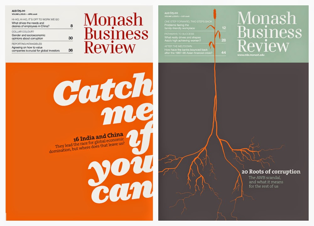
Monash Business Review
Monash Graduate School of Business needed to expand their reach and credibility, not only amongst fellow academics but primarily amongst business professionals—the school’s clientele. This cleverly edited and visually striking journal showcased some of the best thinking from respected academics in the field. Monash Business Review not only placed them at the head of the academic pack, but with articles written in plain English, it was possibly the first academic journal of it’s kind that actually appealed to business practitioners as well as academics. The open collaboration between the editorial and creative teams saw the journal establish a strong voice in business, and a visually playful and engaging format which won numerous international design awards. Although it was eventually wound up after a succession of new marketing managers (a common cause of publication casualty), during its time it proved to be infinitely more effective at enhancing the Monash brand than a billboard or personalised pen could ever be.
 |
| Our cover solution for issue #1 (left) paved the way for the editorial and visual tone throughout both this and future editions. Who said designers were only good with pictures? |
 |
| Books, movies, the world around—nothing is out of reach when looking for cover concepts. |
 |
| Printed on a creamy uncoated paper stock only added to the journal’s welcoming and tactile quality. |
 |
| No other business journal that we know of has ever re-appropriated a personals ad to illustrate global economics. |
 |
| We created all the internal graphics, none of which were for decoration— as the fully-functioning infographic on the cover at right demonstrates. |