Hello

Hello
Showing posts with label Editorial and Publication. Show all posts

Cook, Share, Belong

Cook, Share, Belong began as a simple idea to showcase some of the more popular recipes served to our Studio Assistants at their preschool (because they actually eat the food there). But what it became far exceeded anyone's expectations — an inclusive community fundraising project for the Starlight Foundation, bringing together a network of editorial professionals, local businesses and families that has so far already raised thousands of dollars to change sick children’s lives.

Here’s what Katherine has to say about Cook, Share, Belong:

‘As many parents of young children will tell you, mealtimes can often be a frustrating, drawn-out and unforgiving part of the day.

The food that the kids loved eating last week is this week completely unpalatable, and the only thing that disappears from their plate with any regularity is the tomato sauce.

Through the more trying food-related times, one constant (at least with my children) has remained — they always eat the meals at Wallaby Street Early Learning Centre. In the past, my children have even been given extra helpings of lunch to have for dinner. Knowing that they’re eating well, if only at preschool, comes as a welcome relief to this often gastronomically-frustrated mum.

After discovering that many other parents at Wallaby Street regularly experience the same phenomenon, the idea for this book was born.

As well as bringing you recipes for the meals your children enjoy at preschool, many families have also shared their personal favourites. Here’s hoping this book will help make your family mealtimes a place of cooking, sharing and belonging.’

The boxboard cover adds to the 'down to earth' nature of the book.

As well as featuring recipes, the book incorporates elements of the Early Years Learning Framework
and the preschool's philosophy. Our Junior Studio Assistant getting creative.
Wallaby Street prides itself on the various 'learning journeys' it takes the children on, many of which are
food-related. A selection of these stories are also featured, showing how the children and educators interact
and learn about personal responsibility, community, sustainability and confidence.
All the recipes were donated from the preschool, families and friends — giving a broad cross-section of
tried-and-true meals, snacks and sweets that are both family and kid-friendly.

All the food was lovingly prepared by parents and educators, and professionally styled, art directed
and photographed by our expert (and 100% volunteer) team.
A sentiment that is shared by everyone involved.

Our new home

After much procrastination, we’ve finally finished designing and building our brand new website. It houses everything you can see here, plus stories gathered from our numerous talks & lectures over the years, and a shop where you can own a little piece of Design & Opinion, for a fraction of the price of a magazine redesign or corporate strategy.

Although our new site is now the best place to keep up-to-date with us, we’ll continue to update this space with all the latest as well, so you can keep track whichever way you prefer.

We’d love to know what you think of our new online home, so drop us a line!


Introducing GSMate

We’ve already showcased An Honest Day’s Work here, a bespoke publication created for BJ Ball Papers specifically for Australian designers. As popular as AHDW was, late last year it was decided that due to tightening of various belts, we needed to say goodbye. But not completely...

Across the ditch, for a little while now BJ Ball has been publishing a magazine about paper and printing called GSM. To the uninitiated, GSM means ‘grams per square metre’ and is a term used in the print world to identify paper thickness (so it’s not just a clever name!). The magazine has been well-received in New Zealand, but the reception hasn’t been quite as warm here. This could partly be attributed to the larger and less connected nature of the design industry here, but also the editorial tone of voice, which tries—but doesn’t fully succeed—in sounding like a bonafide Aussie. Interestingly, this demonstrates that even though Australians and New Zealanders have a lot of things in common, our informal vernacular isn’t one of them.

So it was decided that in order to give GSM a better chance here, it needed its own distinctly Australian counterpart that not only reminded readers of what they could find inside the print publication, but also retained the broader editorial elements and tone of voice that made An Honest Day’s Work so popular to begin with. While it was a shame to say goodbye to a faithful companion, it’s a pleasure to now bring GSMate to designers all over this wide Pantone® 153C land.

GSMate is a successful hybrid of the parent magazine, and the best bits of its predecessor An Honest Day’s Work.

Harvest

Sometimes a project is presented to you with such passion that you can’t help but grow attached. When we were approached to design the launch edition of Harvest Magazine, our client’s zeal for this self-funded publication was infectious. The basic premise of Harvest is to showcase and encourage participation in overseas mission work — something close to both our hearts — so we were a great fit.

With an original look and feel created by Soo Coughlan, we were approached to craft a complete mocked-up iPad app, translating what began as a print design to something that would work on a touch screen. The process not only involved re-engineering the building blocks of the master brand (including designing and illustrating each individual page element), but creating a user experience that would appear so natural and intuitive it became almost invisible.

The result is a magazine app that is thoughtful and sincere, but highly engaging. To date the launch edition has been extremely well-received, and has set the wheels in motion for what will hopefully become a self-sufficient, regular publication in screen and print formats. We’re proud of the part we’ve played in bringing this publication to an audience of passionate people (but perhaps none as passionate as our client).

Individual text elements act as direct links to the stories inside.

The content of the launch edition is varied — from regularly-updated community pages, to personal stories
about overseas mission experiences, to in-depth commentary on specific theological issues.

Some of the screens are designed as continuous ‘rolls’, while others are designed to use a ‘controlled swipe’ —
creating the illusion of a traditional magazine, but with the smoothness and functionality of a truly digital one.

Harvest includes a ‘just for kids’ section with videos, simple lessons and interactive activities.

An (extra-special) Honest Day's Work

Graphic designers can be seen as a pretty pretentious bunch—abounding in double-shot soy lattes, swanky gallery openings, skinny designer jeans and ironic tee shirts sporting witty (yet highly aesthetic) typographic in-jokes. But in reality, most graphic designers are hard working, computer-tanned, RSI-inflicted souls who just want to make the world a better place—or at the very least, make it look better.

Some of the people who help designers achieve this dream are the paper merchants who work equally hard at ensuring printed products come to life in the best possible way. One such company is BJ Ball. For a while we’ve been helping them champion the idea of ‘an honest day’s work’ through a designer newsletter. So when they were given the opportunity to promote themselves in the upcoming edition of Justus magazine (well-known among Australian designers), they approached us to help introduce their sales reps more directly to the design community at large. We decided it was time to turn the spotlight around, and find out just what an honest day’s work for someone in paper sales actually involves. The results are entertaining and revealing in equal measure, and we think sum up exactly what life in the graphic design industry is like—regardless of which facet you inhabit.

The opening double-gatefold spread. For the uninitiated, this means it opens out from the centre to reveal an extra-wide spread inside.
To take advantage of the super-wide format, we developed a timeline tracking each sales rep’s movements
from the time they woke up, until they hit the sack (or at least, should have).

An Honest Day's Work

Originally founded in New Zealand, BJ Ball is Australia’s oldest paper merchant. However, despite their long history they were still relatively unknown in the Australian graphic design community, which is a marketplace already over-saturated with eager paper providers. We were asked to help them break through the noise by approaching designers on their level while at the same time reflecting the values of BJ Ball as providing honest, work-horse papers. An Honest Day’s Work was born: a bi-monthly print and email newsletter written and designed by designers, for designers. Each edition features a poster from a different design studio responding to the question “what does an honest day’s work mean to you?” which will eventually form an exhibition bringing together the best of the the Australian graphic design community to celebrate an honest day’s work (yes, we do fall into that category!).

Print newsletter (left) and studio poster (right). This poster was contributed by us.
Visual elements (including the masthead) are lovingly hand-crafted for each edition

ARV Shine

ARV is one of Australia’s largest providers of aged care, and with the population in general getting older there’s more demand for their services than ever. Their flagship publication ARV Shine presents a mix of ARV’s involvement in the community, a showcase of their properties and services, and a broader look at both issues and opportunities for senior Australians. The content is designed in an easy-to-read (but not boring) way, with deliberate choices in typefaces, colour combinations and imagery that give readers a bonafide magazine experience without being patronising. In particular, the absence of generic ‘dynamic senior lifestyle’ stock imagery helps create a magazine that is truly refreshing in this market, which along with thought-provoking content, really Shines.

Using ‘conceptual’ rather than literal imagery for the cover steers this away from cliché. Portraits are intimate
and warm, and are given prominence—the residents are celebrated
Sometimes an infographic tells a story the best
Feature stories focus on wider topics of interest, but with relevance to ARV

New (Zealand) Herald

After a successful redesign of The Weekend Herald—APN New Zealand’s flagship publication and the widest-read newspaper in the country—we were approached in early 2012 to work with them again, this time to help re-imagine their weekday paper. The broadsheet daily was moving to a tabloid format (that doesn’t mean more celebrity gossip, just a smaller size) and they wanted to push the boundaries of what was possible—not only for the new format, but for newspapers in general. We created two directions to ‘bookend’ a series of four options that were presented to market research. Our first direction took a more traditional approach, bringing the Weekday in line with the Weekend paper, and the second direction (which we named the Paradigm Shift) questioned every part of the newspaper—from a cover that functioned as a collectible poster, to working with advertisers on new approaches that would in turn offset the cost of innovations in writing, photography, design and print techniques. In the end the finished product took more of a middle-ground approach, but everyone involved was truly invigorated by the process.

Traditional direction—page one and sport front (back page)
Traditional direction—internal page samples
Paradigm Shift—news/world/business sections form one lift-out book, and sport/life/everything else form another
Paradigm Shift—internal pages, utilising QR codes and a single typeface (Publico) for all elements
Paradigm Shift—‘news wrap’ collectible posters that wrap around the bound news and sport books

A trip down Storybook Lane

Adam & Naomi Fiegl are a husband-and-wife photographic duo who capture intimate family moments and turn them into lifelong family treasures, by featuring them alongside beautifully-crafted children's stories. We were approached to help bring their vision for this series of bespoke storybooks to life. As well as lettering each story by hand, we also consulted on the stories themselves, and the best way to manage the production of each book. The result is a tender yet whimsical collection of poetry and prose that would do any family proud.

All typography is hand-crafted and put together manually
Simple, colourful graphic elements complement thoughtful photography

From the archives I: Concepts from A–Z

Often our best work never sees the light of day—a lot of what we do is initial concept work, which sometimes never makes it past that stage. Oxford University Press approached us to create concepts for their Australian Dictionary and Thesaurus series, which was to undergo a major redesign. A dozen or so agencies were commissioned to produce concepts which were then narrowed down to a small handful, ours being one of them. Unfortunately none of the shortlisted concepts ever went further—the publishers instead opting to incrementally evolve the existing series in-house until they're ready for that big leap into the unknown. We had a ball designing these covers, so if they never make it to the book shelf, at least they made it here.

A range of visual directions based on a single title, a number of rounds into the process
We ended up refining two directions—this one is called Glyphs and uses super-sized letterforms for the
different dictionary titles (e.g. Pocket, Regular, Mini), special characters for Thesaurus/Integrated Thesaurus
and playful typefaces for Secondary and Primary School editions
The other direction we refined was The Big O (also in homage to the late, great Roy Orbison)
which takes the O from the Oxford logo and places it front-and-centre as the hero of every cover.
Changing the colourway outside the O indicates a different title in the Dictionary series,
whilst changing the colour inside the O indicates a different series (eg Thesaurus)

Bringing Asia together

Global Asia is a quarterly journal published by the Seoul-based East Asia Foundation, who believe that economic prosperity and trust between nations can be used to promote peace—not only on the Korean Peninsula, but around the region and the world. Article authors include former presidents, high-ranking government ministers and global thought leaders. With stories that aren't afraid to ‘say it like it is’, the journal’s design aesthetic needed to be equally straightforward and engaging. The lack of any real design budget also necessitated thinking creatively about how to illustrate stories with minimum fuss, but maximum effect—which is an apt summary of the overall design ethos.

As is the case with many publication design projects, what starts out as a one-off engagement often becomes an ongoing relationship. In the case of Global Asia, we continued to work closely with managing editor David Plott (who was also instrumental in the creation of The Jakarta Globe newspaper—another project we were involved with), art directing, designing and illustrating the first dozen issues before an appropriate local designer was found.

A unique aspect of the process was the cross-cultural team—with an editor based in Thailand, publisher in Korea, printer in Hong Kong and art director in Australia (not to mention writers from around the globe), there was a lot of cultural paradigm shifting. And we like to think that’s what Global Asia is continuing to do.

Each cover’s illustration was lovingly hand-crafted, bringing each edition’s theme to life in the most engaging way.

No illustration was used lightly—if it didn’t tell a relevant story, we didn’t include it. In many cases the illustrations
also doubled as infographics—not only illustrating the written content, but enriching it as well.

Occasionally there would be opportunity to include photography or a more in-depth illustration or infographic,
which we always jumped at.


Muse—filling a cultural void

What do you get when you cross an affable American ex-pat living in Hong Kong, a feisty local editor and a handful of Australian designers? Muse Magazine.

The brainchild of former Newsweek executive Frank Proctor, Muse began as a publication to fill what was seen as a ‘cultural hole’ in Hong Kong, celebrating and promoting local writers, critics, artists, poets, photographers and other creative types. Publisher Frank and editor Perry Lam’s single-minded dedication to the advancement of arts & culture in Hong Kong set Muse apart from the outset. But if that wasn’t enough, the brave decision to combine English and Cantonese as complementary editorial voices (as opposed to merely translations of each other) was something that had never been done before.

As non-Cantonese-speaking designers, this posed multiple challenges in itself. It’s difficult enough to create effective typographic hierarchies in your native language, let alone one that uses a completely different alphabet—where even adding too much letter-spacing can completely change the meaning of a word or phrase. Add to this the initially extremely loose editorial structure and lack of any visual collaborators locally, and the task becomes much bigger than ‘merely’ creating an entire magazine template from scratch.

Through sheer determination on Frank’s part, a full editorial team was assembled and an office opened on Hong Kong Island. After much research and cold-calling, a network of artists, illustrators and photographers was slowly built to complement the stable of writers who rapidly agreed to come on board. Once the template was designed (a long and laborious—but highly enjoyable—process), the last piece of the puzzle was finding the right art director to take charge of ongoing editions. This took much longer than expected, and meant Katherine made multiple trips to the Muse office, to fill in as art director and designer for the first handful of issues.

Working in a foreign environment with high-pressure deadlines (and chicken’s feet for lunch) taught Katherine some valuable lessons in both diplomacy and tenacity—lessons she has since taken into multiple pressure-cooker situations at home and abroad.

The dedication shown by the design and editorial team, and most of all the unfailing optimism of the publisher, has helped build Muse into a strong voice for arts & culture in Hong Kong. And although it is no longer in magazine form, Muse continues to play an integral role in the continual flourishing of arts & culture in Hong Kong as a publisher, teacher and benefactor. If Muse set out to fill a cultural hole, it has certainly achieved far more.


Covers featured artworks by local artists commissioned specifically for Muse.
The upfront section featured ‘my diary’, featuring everything one could possibly want to know about upcoming cultural
events. Oftentimes irreverent and always entertaining, ‘my diary’ provided the light to some of the deeper articles’ shade. 


The complimentary way English and Cantonese was used earned Muse the Society of Publishers in Asia Award
for Editorial Excellence (local English category), two years in a row.

Public vs Private

Caliburn Partnership (now Greenhill Caliburn) is the leading independent corporate advisory firm in Australasia, specialising in financial and strategic advice to a range of large-scale corporations. So an equally strategic approach was needed with this annual review—basing the structure around a specially commissioned article penned by Financial Times columnist Tony Jackson. Turning the notion of an annual review from year-long financial summary to a targeted, engaging and respected piece of commentary enhanced Caliburn’s position as market leaders. Overwhelmingly, what projects like this demonstrate is that good editorial communication and design is just as critical (and just as effective) in a branding environment as it is in a newspaper or magazine.

The PMS Warm Red cover (our favourite colour) features a die-cut window revealing part of a quote inside—
at the same time completing the review’s title.

Strong typography and a simple but bold colour palette was used throughout
to illustrate concepts and lend visual gravitas to the content.

New Zealand's weekend companion

The Weekend Herald is a perfect example of how to strengthen an already successful brand—rather than rescuing one when it shows signs of stress. In the world of printed newspapers this has never been more critical. The biggest challenges of this redesign were answering the readers’ need for a small, intimate ‘weekend companion’ without changing the broadsheet size, and in creating a visual framework that would deliver a contemporary, engaging and usable design template not only for readers, but also for the people who put it together. With the latter in mind, a large part of the redesign process was in educating staff at all levels, in group workshops and one-on-one. The result was a newspaper that not only immediately resonated with readers, but a brand that readers felt they were truly a part of. 

A few years later, the success of bold steps we took with The Weekend Herald became the inspiration for an even bolder move—completely transforming the daily paper, which you can read about here.


The redesign included a complete audit of design and editorial elements (we counted around 100 different styles),
and the commissioning of a typeface (Founders Grotesk) by Kiwi typographer Kris Sowersby.

By reducing the number of disparate typefaces and rules we were able to create a highly flexible palette
of elements which could add visual panache without getting in the way of easy reading.

With design discipline comes familiarity—even without a couch-themed ad, this newspaper redesign
definitely fulfilled the brief of creating a ‘friendly companion’ to spend the weekend with.

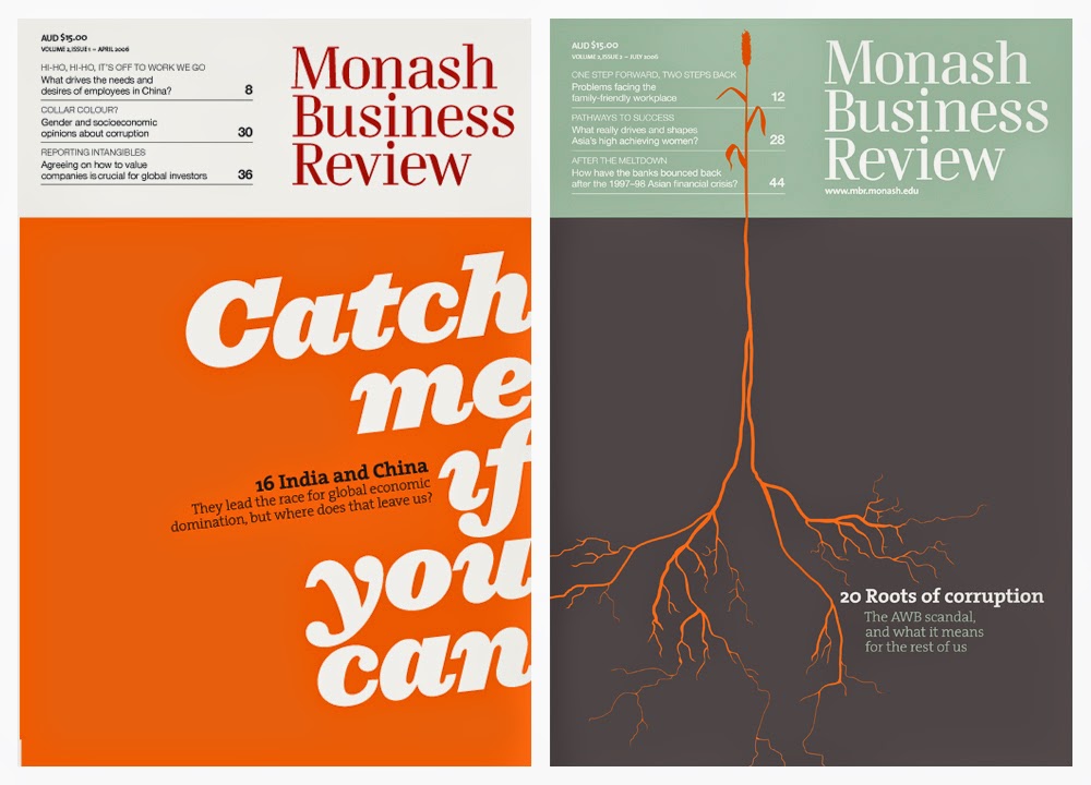
Monash Business Review

Monash Graduate School of Business needed to expand their reach and credibility, not only amongst fellow academics but primarily amongst business professionals—the school’s clientele. This cleverly edited and visually striking journal showcased some of the best thinking from respected academics in the field. Monash Business Review not only placed them at the head of the academic pack, but with articles written in plain English, it was possibly the first academic journal of it’s kind that actually appealed to business practitioners as well as academics. The open collaboration between the editorial and creative teams saw the journal establish a strong voice in business, and a visually playful and engaging format which won numerous international design awards. Although it was eventually wound up after a succession of new marketing managers (a common cause of publication casualty),  during its time it proved to be infinitely more effective at enhancing the Monash brand than a billboard or personalised pen could ever be.

Our cover solution for issue #1 (left) paved the way for the editorial and visual tone throughout
both this and future editions. Who said designers were only good with pictures?

Books, movies, the world around—nothing is out of reach when looking for cover concepts. 
Printed on a creamy uncoated paper stock only added to the journal’s welcoming and tactile quality.

No other business journal that we know of has ever re-appropriated a personals ad to illustrate global economics.

We created all the internal graphics, none of which were for decoration—
as the fully-functioning infographic on the cover at right demonstrates.

The Gruen Transfer

The Gruen Transfer is a popular Australian television program about advertising and its constant presence in our lives. The producer of the show, Jon Casimir, and the good people at HarperCollins publishers wanted to bring the ideas in the show to life in a coffee-table-esque book, further exploring the influence of advertising on the average person’s daily life. The process between author, publisher and designer was refreshingly open and collaborative, and the result is a highly engaging tome packing heavy editorial and visual punches that can be read cover-to-cover, or opened at any page. As Jon colourfully describes it, ‘it’s a real toilet read’.

The outside cover features gold foil stamping, and hides a subliminal message—can you work out what it is?
Meanwhile, the endpapers feature an alphabetical list of every single brand mentioned in the book.
Popular comedian Wil Anderson hosts the TV show and also provided a preface for the book.
Each page is packed with information and provides a visual feast (some more appetising than others).
As well as designing every single page, we also created bespoke illustrations.